Net Number of Migrants by Country, 1950-2020 (by Five-Year Intervals)
Net Number of Migrants by Country, 1950-2020 (by Five-Year Intervals)
Based on data from the UN Population Division, this heat map shows whether countries experience net in-migration (blue colors) and net out-migration (red colors). The default period is 2015-2020; by using the slider under the bar chart, the year setting can be changed. The default displayed country in the bar chart is the United States with the highest net in-migration in the world in the 2015-2020 period. Click on a country on the map to view how the net number of migrants changed in the selected country since 1950-1955.
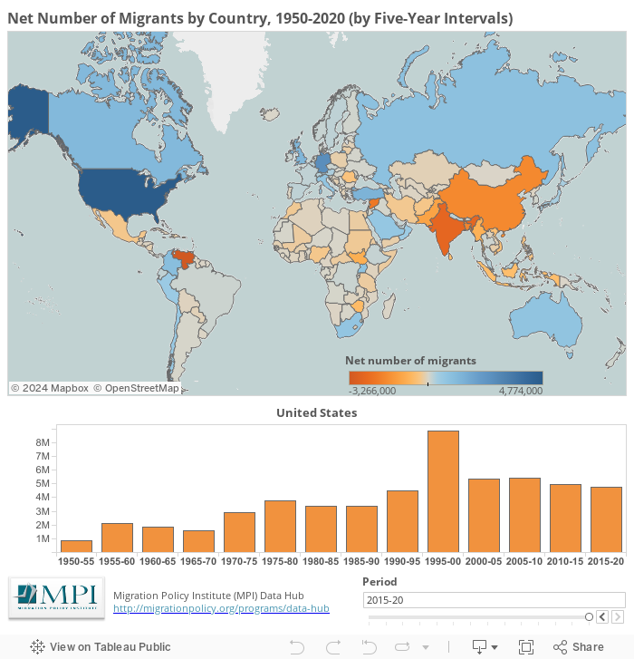
The UN Population Division retroactively updates figures of population change, births, deaths, and net migration. Net international migration represents the movement across the borders of people who change their residence. This estimate includes both in- and out-flows of foreign and native-born populations. The methodology to estimate net numbers of migrants by five-year intervals varies by country. See the UN Population Division notes for details here: http://esa.un.org/unpd/wpp/DataSources/.
Migration Policy Institute tabulation of data from the the United Nations, Department of Economic and Social Affairs, Population Division (2019). World Population Prospects 2019, Online Edition. Rev. 1. Available here: https://population.un.org/wpp/Download/Standard/Migration/.